Tuesday, 30 June 2015

How to Squeeze Every Drop of Valuable Visitor Data from Your Forms (Without Complicated Programming)

It’s the great marketing catch-22: You need visitor data in order to create value-filled, personalized, highly targeted offers. The more information they provide, the greater your ability to build personas that fit your ideal customers.

But your visitors still aren’t convinced. Like jittery fish, you’ve presented them with the tastiest bait, and they’re hesitant to even take a nibble. So how can you get the information you need without scaring them off?

The answer is…

Progressive profiling.

What is Progressive Profiling?

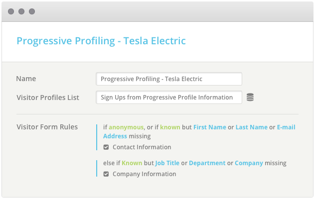
Progressive profiling uses dynamic form fields to ask for and collect information on prospects based on the information you already have about them. Like a first date, it gets to know new customers in a way that’s gentle and unassuming. What’s your name? What’s the best email address to contact you at? How can I help?

Then, as the customer’s interaction with your product or service continues and greater trust and brand recognition is built, more questions are asked – helping you not just capture leads, but build on the intelligence you’ve gained.

Progressive profiling may start with name, email and question, but can gradually lead to vital details that will help you better understand where your prospect is in the buying cycle: are they evaluating products? Comparing features? Focused on pricing?

Asking questions about their timeframe to purchase and where they are in the decision-making process can help you better understand how and where your product fits according to their needs. Understanding how they plan to use the product can give you valuable insights into tailoring your offer across every stage, leveraging the information you already have about them.

How Does It Work?

Let’s say you sell a product and you have an email newsletter filled with valuable tips and techniques on using it. As is often the case, your prospective customer is asked for their name and email address. Simple enough, right?

1

They subscribe and get their first couple of newsletters. They’re starting to feel comfortable with your brand and enjoy what they’re getting so far. Here’s where the progressive part comes in. You’ve got another freebie for them – you just need a bit more information about how they plan on using your product, when they plan to purchase, and approximately how much they plan to spend.

Since you don’t need their name and email address again, the form simply asks the relevant questions you’ve set up. This information helps you gradually begin to understand this customer based on how much they’re willing to share as your relationship with them progresses.

2

Obviously you’ll want to space these out and give as much as you get – take the time to answer questions, clarify features and options, and so on. Don’t expect the customer to be receptive to answering personal questions by day 2.

Don’t Forget Your Best Practices

In addition, you’re not going to want to throw best form practices out the window when implementing progressive profiling. Things like:

Being Clear about What Information is Needed (And How It Should Be Presented)

credit card threadless

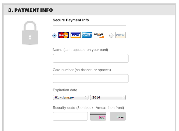
This example from Threadless tells customers precisely how to enter their payment information.

Explaining, if Necessary, Why Certain Information is Needed

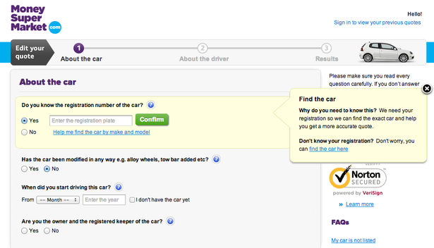
The example below, from Money Supermarket tells people why they need the registration number of their car.

money-supermarket

Source: eConsultancy

Make sure your reasoning is reasonable – Money Supermarket could have said, “We need your information to help get you an accurate quote”, but it still wouldn’t answer the prospect’s why? The fact that they need it to find that same exact car and get you a quote is much more sensible.

What Happens After They Subscribe?

And finally, don’t forget to be clear about what happens after the sign up process is complete. How can they download the freebie? How often will they receive email newsletters? Can they unsubscribe or change the frequency? And so on.

expect-buffer

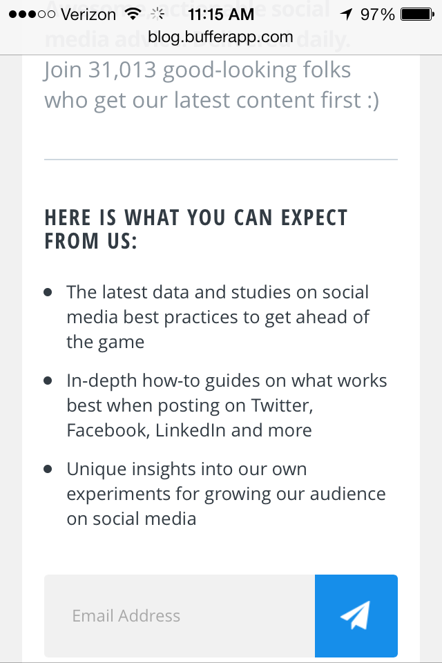
BufferApp sets newsletter expectations before asking for subscribers’ info

How Can You Implement Progressive Profiling?

Progressive profiling is a relatively new function, but there are a variety of solutions on the market that make integrating it into forms easy and hassle-free. Oftentimes, you can do this without any programming knowledge at all. Here are a few services that offer Progressive Profiling as part of their systems:

Salesforce Pardot

progressive-salesforce

Adds a progressive profiling feature that ties in with your existing use of Salesforce Pardot

HubSpot

progressive-hubspot

HubSpot refers to progressive profiling form capabilities as “Smart Forms” and provides a variety of best practices you can follow when implementing them.

Act-On

act-on

As with other services, Act-On lets you define a set of rules for which other form fields will display. The site also provides an example tour through how its Progressive Profiling system works.

JumpLead

jumplead

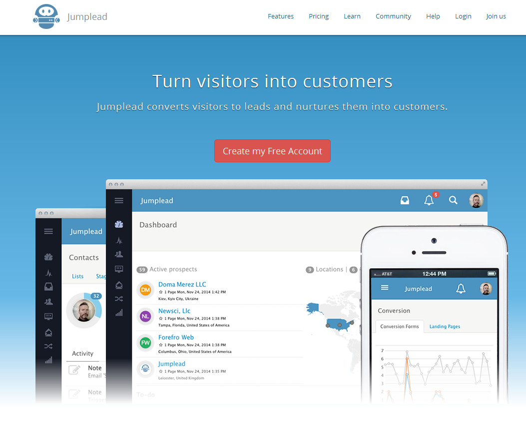
An example of the JumpLead dashboard

JumpLead is a sort of marketing automation/lead generation platform of which progressive profiling forms play a role. Like many of these other solutions, they offer a full scale of marketing automation tools. For WordPress users, JumpLead also has a plugin that can integrate progressive profiling into their existing WordPress system.

How to Get the Best Possible Results from Your New Progressive Forms

It’s easy to fall into the tempting trap of asking for more and more information through more and more form fields as your relationship with the prospect progresses. However, small bits over time (and depending on the customer’s stage in the product’s overall lifecycle, as well as their buying cycle) will help foster a reciprocal relationship while giving them the personal attention and nurturing they crave.

And don’t forget, progressive profiling is just one tool of many designed to help improve your forms and increase your conversion rates. As with any tool, it’s not a silver bullet – it’s all in how you use it. By making progressive profiling a part of your overall sales and conversion optimization process rather than looking at it as “yet another form component”, you’ll be poised to start forming lucrative customer relationships built on a foundation of mutual trust, understanding and expectations.

Now It’s Your Turn

Are you using progressive profiling in your own lead generation forms? How has it worked out for you so far? Share your success stories and triumphs with us, as well as your thoughts on this unique practice in the comments below!

About the Author: Sherice Jacob helps business owners improve website design and increase conversion rates through compelling copywriting, user-friendly design and smart analytics analysis. Learn more at iElectrify.com and download your free web copy tune-up and conversion checklist today!

Conservative Russians are putting flags on profile photos to offset the rainbows

Screen-shot-2015-06-29-at-1.56.03-pm
Feed-twFeed-fb

KIEV, Ukraine — In Soviet Russia, love doesn't always win.

Responding to the wave of pride rainbow-embossed profile photos that washed across social media in wake of the U.S. Supreme Court's ruling that legalized same-sex marriage in America on Friday, some conservative and homophobic Russians are shading profile images the colors of their country's flag: white, blue and red.

More about Social Media, Russia, Facebook, Twitter, and Us World

Simple and Effective Tools for Social Media Automation

Social Toolkit 33: Meet Edgar, with Laura Roeder. Check out the full podcast below or download it on Stitcher, iTunes, or Soundcloud to listen later.

Brought to you by:

The internet's easiest Lead Gen and landing page platform.
Performance marketing solutions to reach & convert your audience on social
The social media easy button for small business.
Where social marketers go to get inspired.

This week we sat down with Laura Roeder, founder of Edgar, a new social media automation tool designed to prevent updates from going to waste, as well as, founder of LKR Social Media. Laura chats with the guys about Intercom, Confluence, Trello, the benefits and features of Edgar, Mailchimp, and the art of email automation.

  • App of the Week: Phind, a new mobile technology that identifies an image of any place (landmark, attraction, statue, business, etc.) taken by a user and provides relevant information aggregated from the top service providers (such as Foursquare, Yelp, Wikipedia, Factual, etc.).
  • Intercom is helping Edgar create a seamless account set up within the app itself
    • How she is using Intercom to guide new users of their app to become active customers through automated email and in-app messages
    • A simple automation tool to effectively assist users
  • Using Confluence and Trello to stay organized and productive with a fully remote team
    • The top use of Confluence for the Edgar team
    • How they use the two apps in conjunction
  • Edgar, the tool designed to prevent updates from going to waste
    • The benefits of using Edgar…hint: We love how effective the app is!
    • Uploading content to Edgar
    • Who is Edgar for?
  • Mailchimp effectively automated
    • A smart use of Mailchimp to attract new users of Edgar
    • Frequency of Email campaigns
    • Follow up sequence for leads vs. customers
    • What’s working for Edgar to generate new leads

Listen to Social Toolkit, Episode 33: Where we chat about the social scheduling service, Meet Edgar, with Laura Roeder. Download it on Stitcher, iTunes, or Soundcloud to listen later.

Shazam Takes On Apple Music Connect With New Social Features Aimed At Musicians And Their Fans

08_Shazam_Android_insitu_final Music discovery platform Shazam is today rolling out a new feature in partnership with over two dozen artists that will allow Shazam users to see which songs their favorite musicians are listening to on the service. The news comes just ahead of Apple Music’s worldwide debut tomorrow, which will introduce streaming music, radio and other features,… Read More

Monday, 29 June 2015

Job hunting? 170+ openings in New York, San Francisco, L.A. and more

14066879786_8f4d7c0480_o
Feed-twFeed-fb

Are you looking for a new career? The Mashable Job Board is the ideal place to search for your next big move. More than 3,000 employers in tech and digital have posted on our board, and they're looking to fill positions from Mashable's community.

Twice a week, we highlight five recently posted openings. Check out some of this week's newest, below, and be sure to read our Job Search Series for valuable career tips.

Position: Data Analyst - Marketing
Company: StyleSeat
Location: San Francisco, California

StyleSeat is the leading marketplace & platform for service providers in the $78 billion beauty and wellness industry. We're continuing to experience hyper growth, and have processed over a billion dollars worth of transactions since being founded. Consumer-facing StyleSeat.com and the StyleSeat Apps are fast becoming the OpenTable/standard for beauty & wellness appointments. We're well funded by blue chip investors, including: Founders Fund, Lowercase Capital, 500Startups, Lightspeed, Ashton Kutcher, Sophia Bush and the founders of Uber and Path. StyleSeat’s environment is highly agile and fast-paced, but also balanced and highly collaborative. Read more...

More about Communications, Social Media, Job Board, Business, and Jobs

Friday, 26 June 2015

The Baskerville Experiment: Font and its Influence on Our Perception of Truth

“Can we separate the form of the writing from its content?” – Errol Morris

“Is it ever possible to understand the meaning of a work of art as separate from the way in which we receive it?” – Lynne Conner

Source: The Pentagram Papers, 44th Edition

In the spring of 1980, Academy Award-winning documentarian Errol Morris (“The Thin Blue Line,” “The Fog of War”) first encountered philosopher Saul Kripke’s seminal book, Naming and Necessity. After reading the book, Morris became fascinated with the theory that words and our interpretation of them are singular manifestations of all of the individual characteristics (seen and unseen) that comprise them.

More specifically, Morris was consumed with the idea that typeface itself might have an innate power to influence our fundamental perception of truth.

“Yes, we read the word ‘horse,’” Morris wrote, ”but we also see the letters, the typefaces, the shape of the word on the page. Is this not part of the meaning? Do we more readily accept (as true) sentences written in one typeface rather than another?”

As Morris continued work on his acclaimed films over the coming decades, this idea continued to haunt him.

Morris collected anecdotal stories dealing with the power of typeface. This included the story of Phil Renaud, a Canadian university student and blogger. While in school, Renaud blogged:

I’m nearing the end of my sixth semester of university, and things are going pretty well: I’m clearing a decent grade point average, enjoying my major, and just having wrapped up my semester’s ‘essay alley,’ wherein all my courses require a term paper or two, and getting my results back telling me that I’m doing much better than usual.

At first, I’m just relieved to be doing so well. Still, ever the skeptic, I start to wonder: what exactly am I doing differently now to be getting all these A-range paper grades all of the sudden?

I haven’t drastically changed the amount of effort I’m putting into my writing. I’m probably even spending less time with them now than I did earlier in my studies, and while I guess you could argue that I’m probably just being a great example of practice making perfect, I’ve got my doubts; I even used to take courses concentrating on writing better essays, and in the time surrounding that, my grades were pretty low.

Then it hits me: the only thing I’ve really changed since I’ve been getting these grades is … my essay font.

Renaud wrote 52 essays in total. 11 were set in Times New Roman, 18 in Trebuchet MS and the remaining 23 were written in Georgia. The Times New Roman papers earned an average grade of A-, but the Trebuchet papers resulted in a B-.

The Georgia essays? A solid A.

“Maybe fonts speak a lot louder than we think they do,” Renaud wrote.

In 2013, Errol Morris finally got the opportunity to test this theory in one of the more remarkable — yet under-reported — social experiments in recent years.

Morris, who had been blogging for The New York Times for five years, penned an article titled, “Are You an Optimist or a Pessimist?Within the article, Morris discussed a giant asteroid that had recently made a close pass to the earth and detailed NASA’s public assurances that world citizens were never in danger of a collision.

Morris concluded the article with the below quote from internationally acclaimed mathematician David Deutsch:

“If a one kilometer asteroid had approached the Earth on a collision course at any time in human history before the early twenty-first century, it would have killed at least a substantial proportion of all humans. In that respect, as in many others, we live in an era of unprecedented safety: the twenty-first century is the first ever moment when we have known how to defend ourselves from such impacts, which occur once every 250,000 years or so.”

Immediately after the quote, Morris included a survey, ostensibly to determine whether readers were optimists or pessimists by nature:

In reality, Morris never intended to gauge the optimism of his readers. Instead, the article served a different purpose.

When presenting the final quote from David Deutsch, Morris — with the surprising cooperation of the Times — randomly segmented the readership into six equal groups. For each group, Morris used a different typeface for the quote — Baskerville, Computer Modern, Georgia, Helvetica, Comic Sans and Trebuchet.

With the help of the survey, Morris hoped to test his theory that different fonts subconsciously influence our perception of truth.

45,000 readers responded to the poll — a large enough sample size to validate statistical differences. What Morris found was astonishing. Baskerville, a 250-year-old serif font, had a statistically significant positive impact on reader’s willingness to trust David Deutsch’s quote.

David Dunning, Professor of Psychology, Cornell, was shocked by the results, which validated with a p-value of only .0083.

“I’m surprised that the damn thing worked at all,” Dunning told the Times. “You are conducting an experiment in an uncontrolled environment. Who knows what’s going on at the other end of a computer screen? Their kids could be screaming in the background for all we know. It could be two a.m. It could be two p.m. They’ve had their coffee. They haven’t had their coffee … The font is on their desktops. There is just a ton of stuff out there that could obscure any results whatsoever … But it is clear in the data that Baskerville is different from the other fonts in terms of the response it is soliciting. Now, it may seem small but it is impressive.”

In a follow-up article, Morris came clean to his readers about the experiment:

Here is my confession. My quiz wasn’t really a test of the optimism or pessimism of the reader. There was a hidden agenda. It was a test of the effect of typefaces on truth. Or to be precise, the effect on credulity …

I do not mean to dismiss the possibility of global catastrophe from asteroids or global warming or a host of other possible calamities — bio-engineered viruses spreading out of control, Malthusian nightmares of overpopulation choking off life on the planet, etc. I wouldn’t want to dismiss even the most outrageous of millenarian fantasies, including Mayan predictions of the end of the world.

But for the moment, I was interested in something somewhat less apocalyptic.

We all know that we are influenced in many, many ways — many of which we remain blissfully unaware of. Could typefaces be one of them? Could the mere selection of a typeface influence us to believe one thing rather than another? Could typefaces work some unseen magic? Or malefaction?

Don’t get me wrong. The underlying truth of the sentence “Gold has an atomic number of 79” is not dependent on the typeface in which it is written. The sentence is true regardless of whether it is displayed in Helvetica, Georgia or even the much-maligned Comic Sans. But are we more inclined to believe that gold has an atomic number of 79 if we read it in Georgia, the typeface of The New York Times online, rather than in Helvetica?

In addition to Morris’ work, there are numerous other studies that have found font to directly influence behavior.

For example, The Atlantic reported on a University of Michigan study where two groups of students were presented with identical instructions for an exercise routine. The only difference between the two sets of instructions was the font.

Students who received instructions in Arial font believed that the routine would be quicker and easier to keep up with than students who received the instructions in a more difficult font (Brush). As a result, students in the first group reported a significantly higher willingness to follow through with the routine and make it part of their daily lives.

To test the results, the experiment was repeated with instructions for a complex recipe. Again, students who received the instructions in Arial were more willing to follow through and cook the recipe at home.

Harvard Medical School, the University of Manchester and Leeds Beckett University have all found there to be a direct correlation between font use for medicinal instructions and labeling and patient understanding of the drug and willingness to use it. The Center for Disease Control, U.S. National Library of Medicine and the Centers for Medicare and Medicaid Services all produce guides on font use, with each group urging the use of simple, medium-sized, serif fonts.

Whether it be because certain fonts like Baskerville simply “disappear” into the subconscious of the reader more easily than other fonts or because they have some deeper mystical power, as Morris implies, we cannot argue that fonts matter.

Similarly, just as using the right typeface can bolster reader perception of our credibility, using the wrong font can be disastrous to perception, even if you are the most accomplished organization in the world.

For example, in 2012, scientists at CERN finally found experimental existence of the Higgs Boson — the mythical “God Particle.” This single particle, which science had been searching for since 1960, is what gives everything in the universe mass. Without Higgs Boson, particles would have no weight, gravity would have no effect and the universe as we know it simply could not exist.

It was astounding, then, when CERN — which houses multiple Nobel Prize winners — chose to announce the most important breakthrough in physics since Einstein’s theory of general relativity in the much maligned Comic Sans font.


Viewers found CERN’s presentation so aesthetically offensive that the font choice became as big of a story as the discovery itself.

The reaction to CERN’s typeface was so strong that particle physicists who should have been enjoying their historic achievement spent the day defending the choice of font.

Now that we know that typefaces influence perception, what can we actually do with this information?

As marketers, we need to be acutely and constantly aware of the typefaces that we are using, and the influence that they have on readers’ perceptions of our individual truths.

Should we abandon all of our favorite or brand-specific fonts and worship before the holy altar of Baskerville? Of course not. Before settling on a typeface for our marketing materials, we should examine our customer theory and carefully consider what we know about our audience.

Are they scholarly? Stylish? Elderly?

Affluent? Skeptical? Children?

Choosing fonts appropriate to our unique audiences, and A/B testing these fonts when possible, can bolster readers’ perceptions of the credulity of our messaging.

There is no one-size fits all typeface, but luckily, there are numerous resources available to help us choose a font.

If ever in doubt, neutral fonts can be used. Helvetica, for example, was designed to be neutral. As explored in the stunning 2007 documentary of the same name, this typeface was created to hold no intrinsic meaning outside of the words.

Helvetica trailer (2007 documentary)

When optimizing our pages, typeface can often get overlooked in favor of more obvious elements, such as page layout, call-to-action, imagery, etc. As the Baskerville Experiment proves, however, in today’s hypercompetitive market, we can no longer afford to leave any page element untested.

Note: Prior to desktop publishing, the term “typeface” denoted the actual collection of characters (e.g. Times New Roman), while the term “font” denoted the full application of said characters (e.g. Times New Roman, 10 point, italics). In recent decades, the meaning of the two terms has converged. Thus, the terms typeface and font have been used interchangeably within this article.

You might also like

A/B Testing: What choices does your content really influence?

Value Proposition: NFL’s Jaguars increase revenue with customer-centric marketing

Value Prop: How Radio Shack lost its way by losing sight of its ideal customer